Earlier Appearances.
i semi-regularly redesign these ’sites as a sort-of ergotherapy. this is a overview of the iterations they’ve gone through.
2021-12: «Toad»
after almost a year of not doing a whole lot with this page, another redesign. i keep coming back to Charter for some reason. it’s just a really nice font i suppose. also, the page is now hosted under dingenskirchen.org instead of dot systems for various reasons.
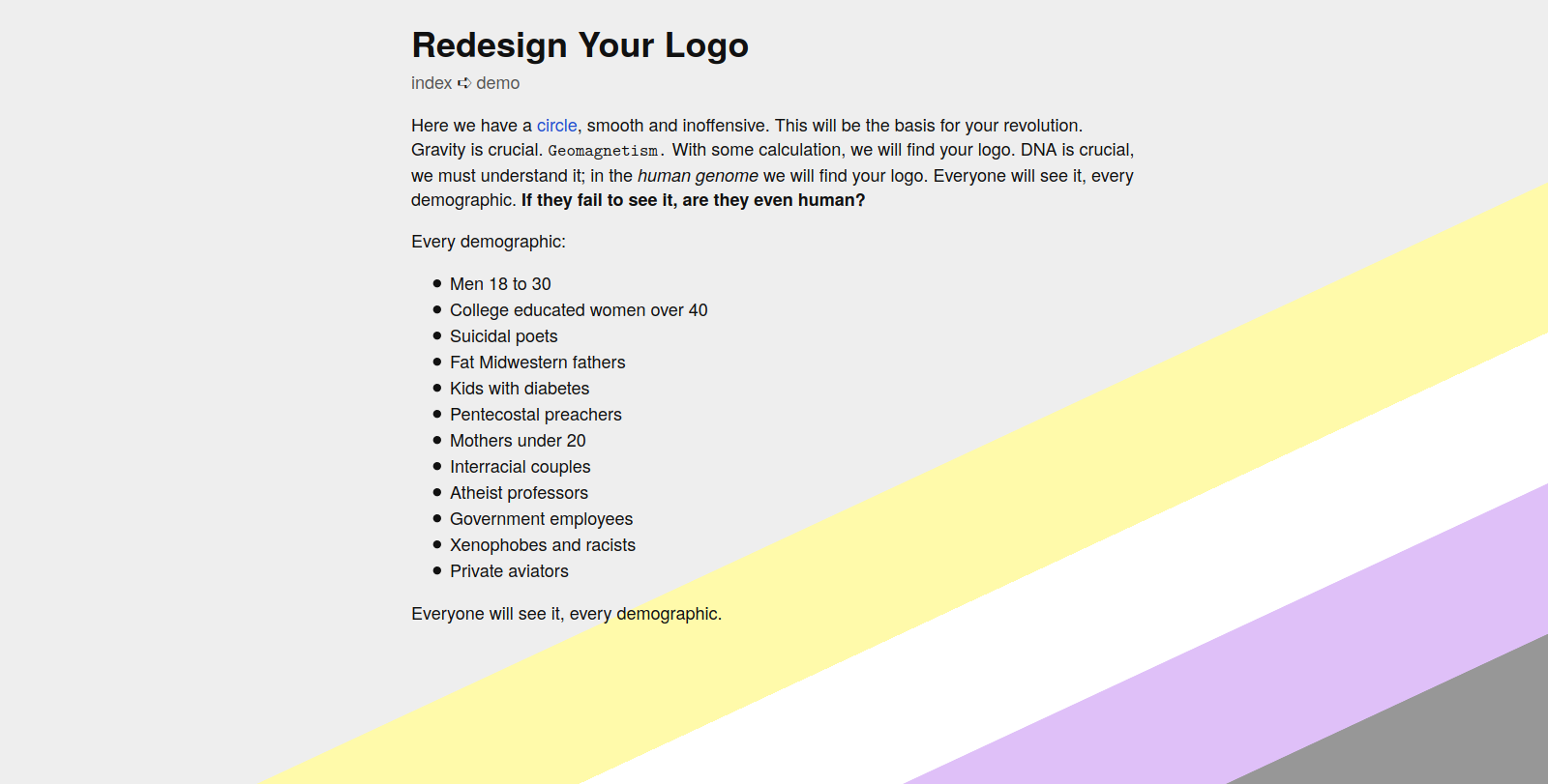
2021-02: «Totally Not The Swiss»
i really liked the giant NB flag from «Manual Override», the rest, not so much. especially the rotated header got tiring rather quickly. so, let’s see how it looks with a font that totally isn’t Helvetica1!
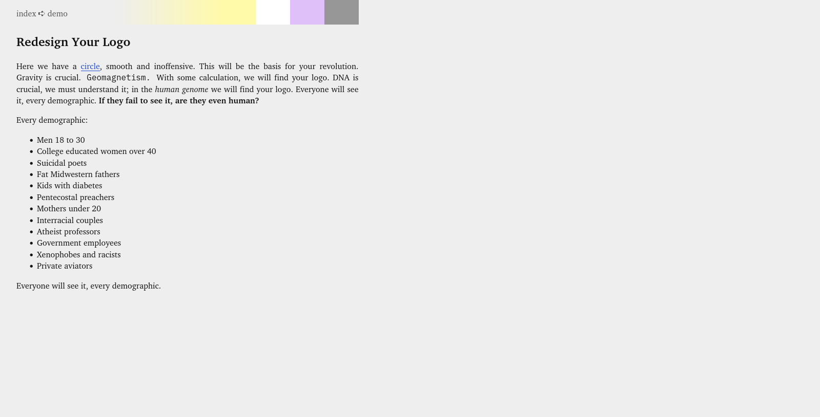
2020-12: «Manual Override»
roughly inspired by this video, a step away from 3D. throwback to «Chartered» by adding an even more obvious pride flag as a design element. at long last, a change in fonts! Charter is gone and has been replaced by Latin Modern Roman and Cooper Hewitt. removed the favicon again. i have been told this looks like «an 80’s computer manual».
2020-11: «95 Luftballons»
add some 3D effects/box shadows. center everything in boxes. with shadows. font choice unmodified. first appearance of hover footnotes. also, i added a favicon.
2020-09: «Nine Nine Nine Nine Nine Nine…»
Reorganization into a grid-based layout. The primary background color is now the default desktop color of a certain ancient operating system.
2020-07: «Chartered»
Based on Charter, light-gray background, and a gradient strip in pan pride colors on the left. Has a dark theme with eigengrau background.
…?
Who knows what came before. I’m bad at remembering stuff.
It’s TeX Gyre Heros.↩︎